Colour Psychology for Website Design: Harnessing Hue to Improve Conversions
Ruby Garner
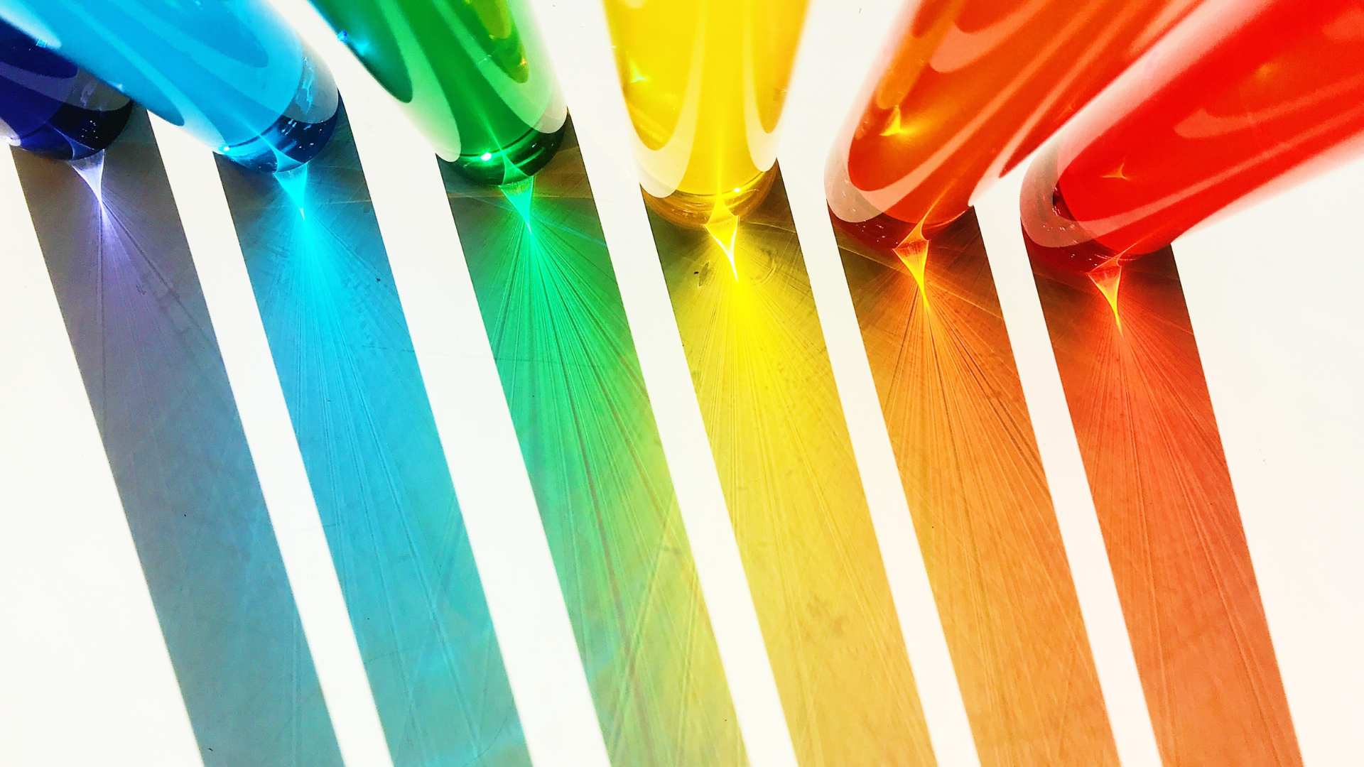
Humans are visual beings; colour can greatly influence our buying decisions. Extensive research by marketers and designers has shown that colour can significantly impact mood, emotions, and spending habits, making it an influential factor in the overall shopping experience.
Learn more below about colour psychology forwebsite design, discover how colour perception influences decision-making, how colour psychology relates to conversion rate optimisation, and explore strategies for selecting the most suitable colours to represent your brand!
Colour psychology is a concept proposing that specific colours trigger physical or emotional responses that affect human actions. Warm colours typically generate energy and cool colours induce relaxation, for example.
These reactions make colour a potent tool in establishing mood. Colour selection can significantly influence how consumers perceive brands and products, making it essential to choose colours that align with your company’s objectives and target demographic. This is especially crucial in marketing, where the right colour can impact buyers’ purchasing decisions.
The Meaning of Colours
Colour is a subtle yet highly effective method of evoking a particular emotion. Colours can evoke happiness or sadness, relaxation, hunger, and much more. Research has shown that specific colours elicit distinct emotional responses, and understanding colour psychology can assist in establishing an emotional connection with consumers. Here are some of the common colour/mood associations:
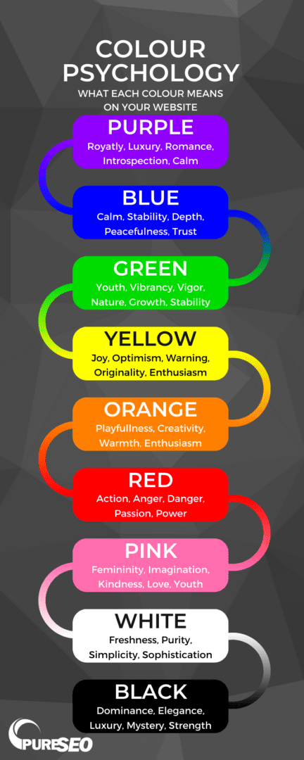
Purple
Purple is frequently linked to creativity, royalty, nostalgia, and wealth. It has the potential to elicit a calming and relaxing effect, but specific shades can also create a sense of curiosity and interest. Purple is often associated with luxury and wealth, and it is commonly used in beauty and anti-ageing products to enhance the perception of quality. Brands can use purple to signal their commitment to providing exceptional services, products, or experiences.
Blue
Blue is known to cause the body to release calming chemicals, resulting in feelings of tranquillity, calmness, and spirituality. Like purple, it is a widely used colour in marketing due to its popularity and association with security, strength, wisdom, and trust. Social media companies such as Facebook and Twitter have opted for blue to give a sense of dependability, which is important for businesses that handle vast amounts of user data.
However, the colour blue also has some negative connotations. The colour suppresses our appetites because few blue foods appear in nature. Additionally, it can also evoke emotions of coldness and unfriendliness.
Green
Green can emphasise regeneration, cleanliness, health, and wealth. Financial institutions commonly use green to indicate growth, financial health, and potential. Moreover, brands that promote environmentally friendly products or aim to project a healing and wholesome outlook can benefit from incorporating green into their branding.
Infographic: what each colour means on your website
Yellow
Yellow is ideal for infusing a brand with gentle energy. It promotes happiness, laughter, hope, and sunshine. As the lightest hue in the colour spectrum, yellow is often associated with upliftment and joyfulness. Similar to orange, yellow can evoke a sense of happiness and playfulness.
Orange
The vibrant orange is known for conveying confidence, creativity, and courage. Due to its playful and lively nature, it is a perfect colour for brands that want to showcase their fun and quirky side. The colour orange is associated with the sun to produce a warm feeling. It evokes emotions of optimism, joy, and confidence. If you aim to create an atmosphere of warmth, happiness, and summer vibes, orange is an excellent colour to incorporate into your palette.
Red
Red is often associated with excitement, energy, power, fearlessness, and passion. Red call-to-action buttons in sales help motivate shoppers to convert since they convey a sense of urgency. Additionally, red can stimulate appetite, which is why fast-food chains like KFC and McDonald’s prominently feature the colour in their branding.
Pink
Pink represents femininity and can add a youthful, imaginative, and quirky feel to a brand. However, it can also generate childish or rebellious vibes. Pale shades of pink can convey kind-heartedness, romance, and love. The colour has a calming effect, making it an ideal choice to balance out more aggressive colours such as black, orange, or red.
White
If you’re aiming for a minimalistic and sleek look, white can be the perfect colour choice for your business. When paired with other colours, it can provide a sense of purity, simplicity, and sophistication. White is also versatile and can create a fresh and clean aesthetic. However, too much white can give off a sterile, hospital-like feel, and without any other colours, it may make your brand appear dull and uninspired. As with any colour, context and balance are crucial in creating the desired effect.
Black
Black is a colour that represents strength, power, and dominance. It can convey a confident message to potential customers in e-commerce and give an air of mystery and luxury. As a staple colour, it can make a brand appear sophisticated, powerful, and elegant. Luxury companies often use black to create sleek and refined logos. However, the overuse of black can create a dull and gloomy atmosphere. It works best in moderation and alongside tranquil colours to balance its intensity.
7 Ways to Use Colour Psychology to Improve Conversions
In today’s world, competition among brands is fierce, and businesses must find ways to stand out and connect with their audience. One way to do this is by utilising the psychology of colour. Here are a few ways to effectively use colour psychology to improve conversions and increase customer engagement.
Design For Emotion – To begin with, determine the emotion you want your audience to experience, whether it’s fear, curiosity, or confidence, whether you’re reconsidering your brand’s colours or selecting a palette for new advertisements. After identifying the desired response, select the appropriate colour to ensure a successful outcome.
Think About Colour Allocation – The allocation of colours in your page design is crucial. You may encourage feelings of passion, but a completely red web page may be a bit much. As a general rule, you can follow these guidelines:
60% for your background: Since your background is typically the largest visual element of your landing page, dedicate 60% of your colour scheme to it.
30% for your base colour: The second most prominent visual space on your landing page is your base colour, which covers your header, footer, and potentially your contact form. Allocate 30% of your colours to these areas.
10% for your accent colour: Your accent colour should feature on the most critical elements of your page, such as your call-to-action button. It should only account for 10% of your page but should be highly noticeable to draw attention. Use a contrasting colour to make it stand out.
Understand your audience – Different colours elicit different emotions and responses in people, so it’s important to understand your audience and their preferences. For example, consider using more feminine colours if your target audience is primarily women.
Use contrast – High-contrast colour combinations can draw the eye to important elements on your website, such as calls-to-action or product images. Use contrasting colours in a way that is visually appealing and helps to guide the user’s eye to the desired action.
Consider colour harmony – Use colour harmonies—or combinations pleasing to the eye—to create a cohesive and visually appealing design. Analogous colour schemes, which use colours next to each other on the colour wheel, can create a sense of harmony and balance that improves UX, which can improve the conversion rate.
Highlight important elements – Use colour to draw attention to important elements on your website. For example, use a bright, contrasting colour for your call-to-action button to stand out and encourage clicks.
Be consistent – Consistency is key when it comes to using colour psychology. Use a consistent colour palette throughout your website to create a cohesive brand identity and establish trust with your audience, making them more likely to convert.
Make Colour Psychology Work for Your Site
Understanding colour psychology and how it influences human behaviour can be an incredibly powerful tool in marketing and branding. Colours can evoke specific emotions and associations, creating the desired mood and connecting with customers. By choosing the right colour palette and incorporating it into the website’s design and branding, businesses can create a unique and memorable customer experience, increasing conversions and customer loyalty.
Ruby joined the content team in August 2021. An avid reader and writer since she was young, Ruby always knew she wanted to work with words. After leaving high school, she studied a Bachelor of Communications majoring in journalism at Massey university. She spent a few years working as a journalist for a news app in the area she grew up in, Matakana, before joining the team at PureSEO.
Ruby also worked part time as a preschool teacher to save money for travelling. So far she has ticked Vietnam, Cambodia, and Bali off her list, and she hopes to be able to travel again soon.
GET ACTIONABLE ADVICE, WEEKLY
Subscribe to our blog and get awesome digital marketing content sent straight to your inbox.
Follow Us
FREE SEO REPORT - INSTANT
Your report will display in a new tab once you submit this form.