
ECommerce websites have become cornerstones of online trade. There’s a huge market out there for providing eCommerce solutions and helping customers reach their goals, but within a saturated market, retailers face the challenge of making sure that buyers have a frictionless experience. After all, another choice is just a click away.
And it’s easy to go wrong when it comes to user experience (UX). UX has a huge role to play in both engaging customers and keeping them engaged, so any UX mistakes can be costly, inflating bounce rate and driving down rankings. However, these mistakes are avoidable with some basic planning.
Here are five UX mistakes that can affect the sales and rankings of eCommerce sites.
1. Poorly Optimized Product Pages
According to Vertical Leap, 98 percent of shoppers discontinue a purchase because of incorrect or incomplete product descriptions. Accurate and detailed product descriptions don’t just help sales either; they actually reduce the likelihood of complaints and returns.
A well-designed product detail page (PDP) is a vital element of any eCommerce marketing strategy, as it’s the make-or-break point of the funnel; here a customer will either convert, or leave. This is why you must provide as much product information on this page as possible. A lack of information, or even something as seemingly innocuous as a low-quality image can turn your customers away.
Structured data and a well-designed product page are immensely helpful in boosting your SEO efforts, as product schema helps highlight your page in the search results page, and the page itself converts the visitor.
Here are some ways to create an impressive product detail page that converts.
Make It Detailed
Don’t go for static descriptions that just show the basic information. Include specific details like size, dimensions, weight, and material type, etc. Include a specification sheet or charts if relevant, as support information can help customers decide in their favor.
For instance, note how Nike implements a pop-up to share precise product details.
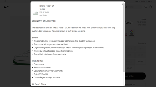
Source: https://www.nike.com/in/t/air-force-1-07-shoe-sX3XKm/CV1724-103
Address Image Issues
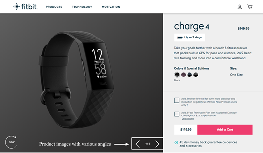
There are two main ways of tackling product image issues in eCommerce websites.
- Make the image a clickable feature. This will enlarge the images and allow shoppers to view them from every angle.
- Include a large-size high-quality image for a better view.
It is good practice to provide multiple images for every product in your store. Use images that show the product in a real-life scenario if possible.
Check out how fitness and consumer electronics brand Fitbit displays multiple high-quality images of their products below.
Source: https://www.fitbit.com/global/us/products/trackers/charge4?sku=417BKBK
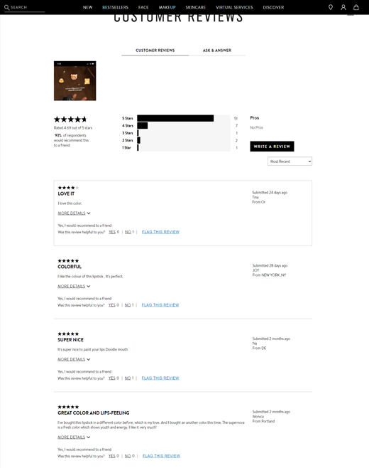
Include Product Reviews
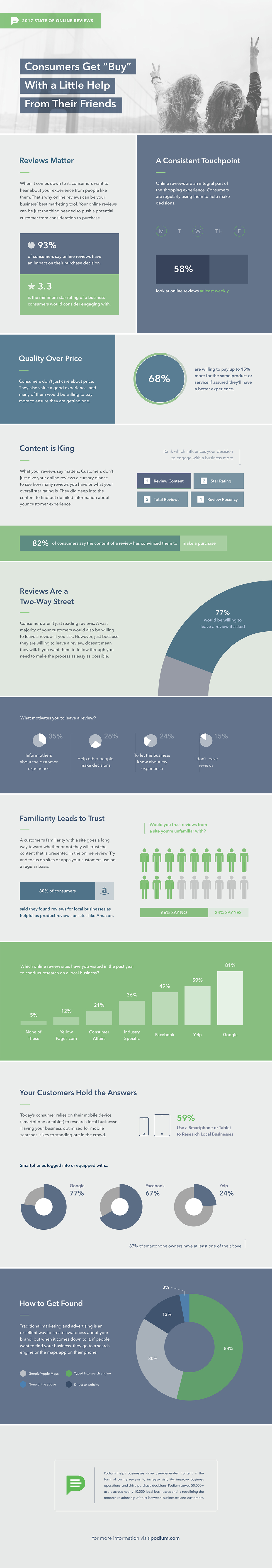
Product reviews are an essential aspect of an eCommerce business. They help boost your store’s credibility and reduce customer churn. In fact, according to an infographic shared by Podium, 93 percent of shoppers are influenced by online reviews.
Below you can see how cosmetics retailer Bobbi Brown displays an extensive list of customer reviews for every product.
Source: https://m.bobbibrowncosmetics.com/product/2342/69380/makeup/lips/lip-color/luxe-shine-intense-lipstick/fh19#/shade/Red_Stiletto|responsive-tabs-powerreviews1
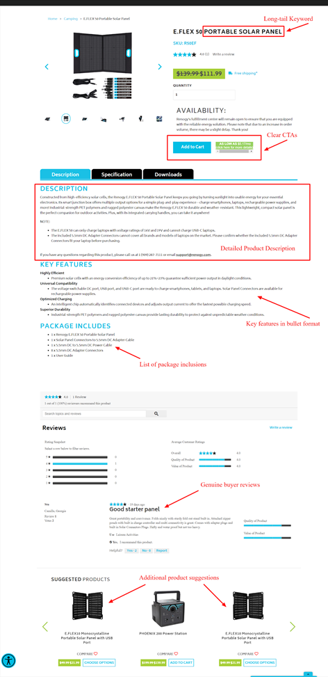
Focus on Product Page SEO
It’s important to include the targeted keyword in product titles and meta descriptions on the PDP, as this is a major factor in driving more traffic to your eCommerce website. If you aren’t sure about creating a PDP that’s optimised for search engines, involve your in-house search marketing team or an SEO expert for the job.
Here is an ideal example of a well-optimized product detail page:
Source: https://www.renogy.com/e-flex-50-portable-solar-panel/
2. Confusing Navigation
Navigation is an essential aspect of user experience. If your website structure is complex and multiple clicks are needed to reach a specific page, a user is liable to abandon your website. Ideally, your online store architecture should be set up so that each page is at most 4-clicks away from the homepage. Here’s a detailed post that’ll help you setup an SEO friendly website structure.
Your design strategy should aim to ensure smooth navigation for site visitors. For instance, a search bar leading to every page will enhance the user experience and aid in conversions.
ECommerce platforms like Shopify Plus and Magento can be handy here, as they offer more customisation options, improved automation, and enhanced multichannel and omnichannel functions. These platforms help enterprise-level brands simplify their designs and navigation channels, and draw in a higher volume of traffic to their stores.
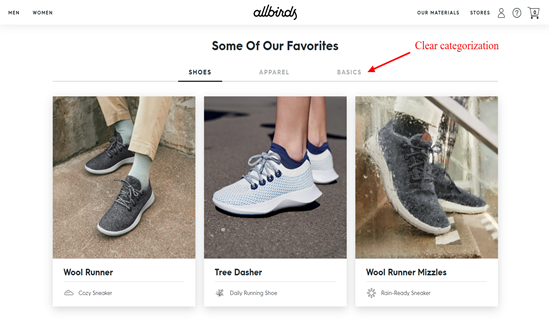
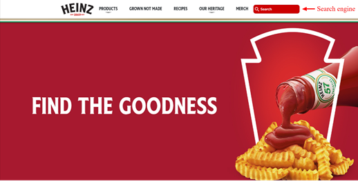
Here are examples of Allbirds and Heinz adopting the Shopify Plus platform to simplify their website design:
Source: https://www.allbirds.com/
Source: https://www.heinz.com/
3. Complex Checkout Process
While purchasing from an eCommerce website, customers prefer a fast checkout experience. A complicated online buying process can prove to be a barrier for some customers, and common mistakes on this front include:
- A long checkout form.
- The absence of a secure platform badge.
- High shipping costs or hidden charges.
Here are a few simple steps to eliminate these issues:
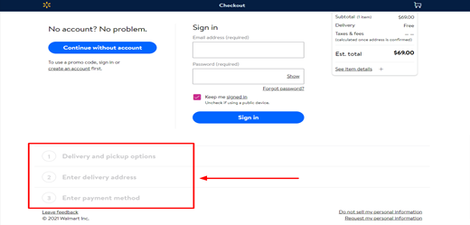
1. Avoid Unnecessary Steps
Reducing the number of form fields can save customers’ precious time, and vastly increase your chances of securing a conversion.
Source: https://www.walmart.com/checkout/#/sign-in
This is what the checkout page of multinational retail company Walmart looks like. Just three simple steps to fulfill an order!
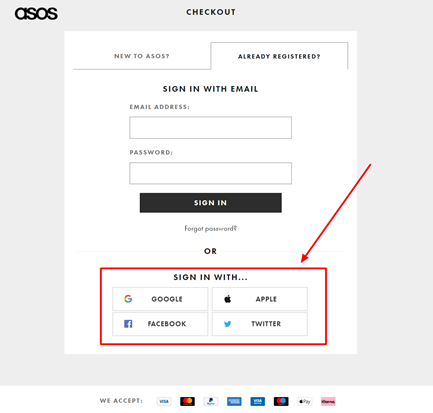
2. Let Customers Purchase in Guest Mode
Offer customers the option to checkout as a guest, making it easy for them to make a quick decision. Alternatively, ask them to register on your website after a purchase, rather than before, or get them connected with your brand via social accounts like Facebook or Instagram.
Look at the social sign-in option used by the British retail eCommerce platform, Asos, to boost sales by collecting user information.
Source: https://my.asos.com/identity/login?signin=6239710bdc4e953820c209ba5072bb94
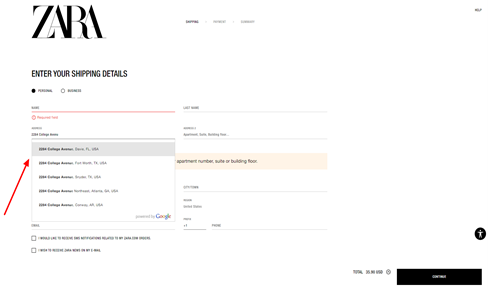
3. Allow Auto-Filling
Integrate a software tool that enables addresses to be auto-filled and validated as they are being entered. This will speed up the checkout process and improve UX.
Notice how Zara is an expert at this:
Source: https://www.zara.com/us/en/shop/52449298918/user/personal-data
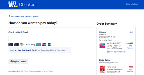
4. Limited Payment Options
ECommerce websites thrive on conversions, but not offering a variety of payment options is enough reason for many customers to abandon their carts.
Some users prefer using credit or debit cards like Visa, MasterCard, or American Express, while a few buyers may want to use PayPal or an e-wallet. Consider the payment options preferred by your target audience and offer enough to encourage buyers to complete their purchases.
Multiple payment choices lead to a higher rate of completed payments, which means higher revenue. Subsequently, customers enjoying the benefit of multiple payment options are more likely to recommend you to others.
Take a look below at the payment options offered by the consumer electronics company Best Buy. No wonder it’s one of the most preferred consumer electronics stores in the US.
Source: https://www.bestbuy.com/checkout/r/payment
5. Not Updating Google My Business Page
Google My Business (GMB) offers eCommerce stores a fantastic opportunity to boost their search rankings, but it often goes underappreciated and unused. Put simply, this crucial tool helps prospective buyers find you. Skip updating your GMB page and you are liable to be missing out on potential leads, sales, exposure, and revenue.
A majority of people looking for brands do so on Google. For local search queries, Google fetches information from Google My Business profiles and displays that prominently, so it’s vital to create and maintain an accurate representation of your business there.
Follow our guide “How To Optimise Your Google My Business Listing” to ensure your GMB listing is optimised.
It’s all about putting yourself in the customer’s shoes
Ultimately, Google values the customer experiences, so if you can make it simple, straightforward, and positive, you will reap the benefits. Ensuring that your website offers a great user experience is the only way to stand out from the competition online, and keep your target audience from bouncing out of your page.
When planning a robust UX strategy, make sure you avoid the common mistakes shared above. Do you know of any other common UX mistakes that we have missed here? Let us know in the comments section below!


