Leslie Tan

Landing pages are one of the most important parts of any website. When you get that valuable click, the next step is to gain a conversion. Creating a landing page that results in a user taking action can be difficult. Last month, we reviewed some of the best landing pages that you should imitate for your website. This month, we wanted to share with you some bad examples of landing pages and how we would go about fixing them.

The problem with this landing page is that it is fairly unattractive and kind of boring. If you place yourself in a shopper’s shoes, they have clicked on your advertisement because they are interested in silk flowers. They would probably rather see pictures of the silk flowers than a large description that is stuffed with keywords. A more effective landing page would have a gallery of their most popular silk flowers with eye-catching photos of the products.

This is an example we found on the old SAP website. The landing page looks like a search engine results page. The text is difficult to read and does not entice people to click more. SAP is one of the most recognisable software companies in the world and is known to be an expert in their field. So it’s surprising that this was their landing page.
For this type of page, we would recommend making the titles bold and clear. They could also incorporate visual imagery for each unique resource. This would help make the content on the page more scan-able for website visitors. Website visitors could simply scan the titles and if any of the content interested them, they could click further.

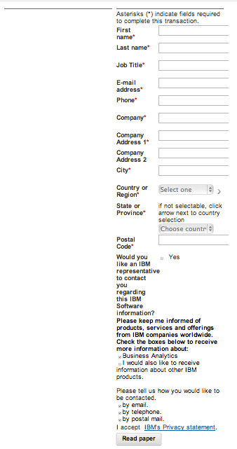
This landing page uses no titles, images, or descriptions. The page is just a download form and the form itself is also unnecessarily long. A website form such as this one can actually put people off from completing the form. When you have any sort of form on your website, the fields that you choose to use should ask for only the most necessary information.

This landing page example is all over the place with multiple coupons for many different products. If a user were searching for wheel barrels and landed on this page, their attention would be easily drawn to other offers or they would simply click away after being overwhelmed with all of these offers. If you have an advertisement that says ‘wheel barrels for sale,’ it is more effective to focus on that one offer.

Okay, so this last landing page isn’t real (thankfully) but it is a great example of what not to do with your landing page. From the interesting colour decisions to the contact form, it’s easy to pick out the many things that are wrong with this landing page.

