There are many elements that go into developing a successful landing page, and choosing the right images is a crucial aspect of that process. Here are some tips to help you find the perfect images for your landing page and get those conversions.
- Look professional
Your landing page needs to look really professional because a badly designed page may raise red flags in your visitor’s mind about your company, product or service. Your images should convey that your company is reputable and trustworthy. Trust is required to convert a visitor into a lead.
- Draw attention
An eye-catching image can be used to represent a product, company or offer, drawing the user’s attention to the content in question. When confronted with large blocks of text, especially online, the human brain automatically tends to start skimming over it, instead of reading it in detail. Images improve readability by breaking up visual monotony and can help highlight links, features or product benefits.
- Create context
Create a great visual hook and tell the story of your service or product with images instead of designing a text-heavy page. Photos can provide the user with visual context, (e.g. by using pictures of the author or presenter in their office) or highlight the main features of the product while in use. Keep in mind that the photo you choose will likely set the reader’s entire mood, so make sure that the mood of the photo fits the mood of the text.
- Keep It relevant
Ensure that the landing page features imagery that clearly shows your product or service achieving its purpose. The goal is always to get the visitor to choose between converting or returning to the homepage for more information. Irrelevant images simply distract your visitor from taking action or might make him bounce from your website.
- Stay simple
Stick to your colour scheme and don’t go crazy with the images. You want to keep your landing page simple and focussed and not overwhelm your visitors and risk losing conversions. Keep your general website colour scheme in mind when choosing images so they don’t clash.
- Know Your Audience
Your audience needs to know that you understand them. You should use images that you know will resonate with them and are likely to evoke relationships between the user and your product or service.
- Use Images of People
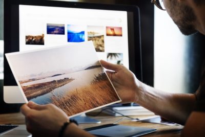
Photos of people help your users emotionally connect with you and your brand. But be wary of using stock photos of people. The inauthenticity of many stock photos can repel people instead of evoking authentic emotions. If at all possible, use photos of real people, customers or staff. You could show them using the product or at work. Also, carefully consider the emotion being conveyed by the person in your photo as this will influence the visitor.
- Pick Quality
One of the most significant barriers to conversion is a lack of trust. Online visitors don’t get the benefit of walking into a physical store to see if you are a legitimate company, so they have to rely on your online presentation. The quality of the photos used is a significant indicator of perceived credibility and value. It would be better to go without a photo than to try and work with bad ones.
Ultimately when it comes to your landing page designs, there are some images that perform much better than others do. However, every image will have a significant impact on your landing page performance, so choose your images with thoughtful, creative and relevant consideration. And don’t forget to test!
To help get you started, here are a few go-to sites to check out for all your landing page image needs:
These sites have lots of royalty-free photos to browse and use on your landing page, with vast selections of everything from objects, to people, to nature, to signs and more. Remember, your landing page and its images play a critical role in getting your visitors to act!


