Google Rolls Out New AdWords Interface To More Advertisers
Rachel Matela
Back in March of 2016, Google announced that it was beginning a major AdWords redesign process to give the ageing interface a much-needed facelift. The new interface has been in the works for some time now, and over the past few months, several accounts have been granted alpha level access.
When you first get access to the new interface, you may see a notification in the top right corner or at the bottom of the screen asking you to “Try the new AdWords.” Don’t be afraid to click on it – you can toggle back and forth between the old and new interfaces so it’s not an irreversible change. You will also be given a guided tour the first time you load the new interface.
The updated UI looks a lot sleeker and comes with several visualisations that make it possible to analyse data much more quickly and efficiently.
Daypart Reporting
With the Day & Hour card, you can now immediately see which day of the week and/or hour of the day leads to the most conversions (or any other metric). In the old interface, gleaning this type of useful information would have required data exports and pivot tables.
Simply click on the dropdown menu in each of the three views – Day, Hour or Day & Hour – to select a metric, such as conversions or clicks. You can now tweak your bid adjustment strategy to reflect the days and times that result in the most activity.
Devices
In the new UI, you can now see your account and campaign performance broken down by device (mobile phones, tablets and computers) for three metrics at one time in an easy-to-read chart. Within the campaign-level Overview, you can also see notes about device bid adjustments.
Within the campaign-level Overview, you can also see notes about device bid adjustments. Clicking on one of these notes transports you to the devices screen where you can make bid adjustment alterations, so if you notice that your campaign is performing really well on mobile and you want to increase your bids for mobile searches, you can now do it easily and efficiently.
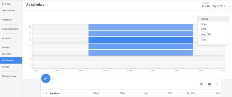
Ad Scheduling
The Ad Scheduling visualization has also been improved in the new interface. In the old interface there is a bar chart depicting when ads are running and a line graph depicting performance metrics, but no data about dayparting. Now you will see one chart depicting the ad schedule and metrics broken down by day.
These new features are just a sampling of what the new AdWords has to offer, and Google will likely continue to add more features as it rolls out. So keep an eye out for more exciting changes to come!
Rachel is a Filipino Kiwi with a passion for the arts. Having graduated with an Arts Degree in English from UoA, she found writing work at PureSEO as a Junior Copywriter and quickly moved on to the role of Editor. In her spare time, she reads Austen and teaches dance classes in the weekend.
GET ACTIONABLE ADVICE, WEEKLY
Subscribe to our blog and get awesome digital marketing content sent straight to your inbox.
Follow Us
FREE SEO REPORT - INSTANT
Your report will display in a new tab once you submit this form.