A strong call to action is essential for any successfuldigital marketingstrategy. A well-crafted CTA can motivate your audience to engage with your website, from booking and purchasing to subscribing or downloading an eBook.
Below, we’ll explore the key elements of a powerful call to action and provide practical tips to help you create CTAs that resonate with your audience and drive results. So, read on and learn how to create a call to action that converts!
A call to action, or CTA, is a crucial element of any webpage, advertisement, or content that aims to motivate the audience to take a specific action. Its primary purpose is to convert visitors or readers into leads but, depending on the content’s objective, CTAs can prompt various actions.
For a CTA to be effective, it must convey a clear message about what the viewer can expect by taking immediate action. Clickable text, buttons, or pop-ups are among the most common forms of CTAs, as they provide a visual guide viewers can follow toward the desired outcome.
Types of CTAs
Buttons
Buttons are the most frequently used CTA, featuring an actionable phrase on an icon, prompting users to click and engage in further action. While button designs may vary depending on the brand style and campaign objectives, they generally require a high-contrast colour to distinguish them from other page elements.
Banners
A CTA banner can be positioned at the top, bottom, or side of a webpage, featuring engaging copy and design to motivate visitors to click and act. These banners often use eye-catching visuals and persuasive language to draw attention and encourage engagement, making them an effective way to drive conversions and guide users through the sales funnel.
Links
Contextual links are typically embedded within the body copy of a blog post, consisting of clickable text that guides users to a relevant landing page. Incorporating relevant links within your content can direct your audience to additional resources, products, or services related to the topic they are reading about. This helps enhance their experience and encourage further engagement with your brand.
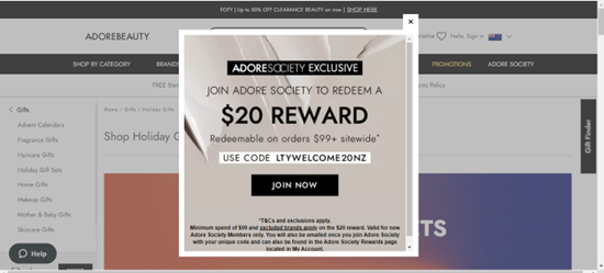
Pop-Ups
Pop-ups appear in a small window and can be a powerful way to grab a user’s attention. Unlike static CTA buttons or forms, pop-ups can effectively communicate an offer or encourage users to sign up for a service. Exit-intent pop-ups are another popular option, appearing when users are about to leave the website.
Why are CTAs important?
A powerful call to action is crucial to your webpage and overall sales funnel. When prompted to act, people are more likely to follow through. By making the next step clear and straightforward, you can increase the likelihood of visitors continuing through your sales funnel and ultimately converting.
Additionally, a well-crafted CTA can encourage users to engage further with your website. For instance, placing a CTA at the end of a blog post can offer users links to explore the topic or invite them to share their thoughts in the comments section. By encouraging users to spend more time on your website, you can help them become more familiar with your brand, which can foster trust and pave the way for future conversions.
Seven Tips for Creating an Effective Call to Action
A strong call to action can prompt your audience to take the next step, whether purchasing a product, signing up for a newsletter, or downloading an e-book. Here are a few practical tips on creating a compelling call to action that engages your audience and drives conversions.
Know your audience: Grasp the characteristics of your buyer personas and communicate with them based on their current position in the buying process. Utilise various CTAs during different phases, such as:
“Discover More” with information relevant to the Awareness stage.
“Get the eBook” or “Sign Up” during the Consideration stage.
“Buy Now” for the Decision Stage.
Keep things short: Instead of using sentences, use concise phrases that deliver a clear message. Typically, two to five words are enough to convey your message effectively. However, in certain instances, you may use slightly longer CTAs, up to five to seven words, if they offer added value. For example, “Buy Now and Get 30% Off” is a longer CTA that adds value to the offer.
Use compelling language: Dynamic language can encourage your audience to take the desired action and drive conversions. Make the most of your CTA by leveraging action words or phrases, such as “claim now,” to motivate your viewers to take immediate action. A helpful approach is to begin your CTA with a verb, like “buy,” and follow it with an adverb, such as “now,” or a subject, such as “eBook,” or both. This format can help ensure your CTA is clear, direct, and compelling.
Add a sense of urgency: Incorporating a sense of urgency or immediacy in your CTA can prompt your viewers to act promptly and avoid losing interest in your offer due to distractions. Words and phrases like “limited time offer” can effectively convey the urgency of responding immediately. Such words can create a sense of scarcity and motivate your audience to take prompt action to avoid missing out on the opportunity.
Make it attractive: Your CTA’s design can significantly impact its effectiveness. Use a distinct colour for the CTA text or a brightly coloured button to attract the viewer’s attention. By doing so, you can improve the visibility of your CTA and make it easier for your audience to locate it. Utilising ample white space around the CTA can also enhance its visibility and ensure it stands out from the rest of the content. With these design considerations, you can create CTAs that catch the eye and encourage action.
Place Your Call-To-Action Buttons Effectively:Consider the placement of your CTA. You can position your CTA as a closing statement for a blog post, a side panel button on a webpage, or strategically within an email. Since the brain naturally reads text from the top down and left to right, this rule is particularly relevant to English-language text. Placing your CTA buttons towards the right or bottom of the page is often considered the most effective location and has been shown to outperform other placements. Thoughtfully positioning your CTAs can optimise their visibility and increase your audience’s likelihood of taking the desired action.
Experiment (Using A/B Testing): One effective method to determine the effectiveness of your CTA is to perform A/B testing, which involves testing two different CTAs against each other. To do this, you can direct half of your users to a landing page with one CTA and the other half to a different page with a different CTA. By comparing the conversion rates of the two pages and identifying which CTA leads to more conversions, you can optimise your future CTAs. Once you have determined the most effective CTA through A/B testing, you can use it as a benchmark to test subsequent CTAs.
Eight Examples of Exceptional CTAs
To help inspire your CTA design, we have compiled some examples of effective CTAs that have successfully driven conversions and engagement for various businesses.
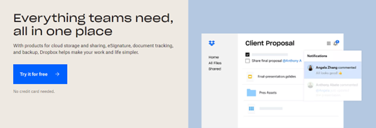
DropBox: Try it for free
The straightforward design and use of negative space allow the “Try it for free” button to grab attention on the page. The blue colour of the CTA matches the Dropbox logo, making it easy for visitors to associate it with signing up. Overall, it’s a successful example of a call to action.
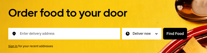
Uber Eats: Find food
Uber Eats’ CTA is simple and concise and offers a solution to a customer’s problem. Hungry? Find food. The CTA is the first thing you see when you visit the Uber Eats site, which increases the audience’s likelihood of taking the desired action.
Grammarly: Get Grammarly, It’s Free
The CTA stands out and is surrounded by ample white space, drawing visitors’ attention to the action. Additionally, including “It’s free” in the CTA is persuasive. The page’s simple and clear design emphasises the importance of the CTA.
Netflix: Get Started
Netflix’s CTA stands out with clear instructions on the button, prompting users to enter their email address to “Get Started.” The offerings are placed above the CTA, making it easier to draw attention.
Slack: Talk to Sales/Try for Free
The “Try for free” and “Talk to Sales” buttons are simple and direct CTAs encouraging visitors to continue their customer journey.
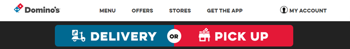
Dominos: Delivery/Pick Up
Dominos realised that a single CTA may not attract all visitors, so they provided two options to get a pizza via “Pick up” or “Delivery.” Both CTAs have clear and actionable language, encouraging visitors to proceed with the purchase.
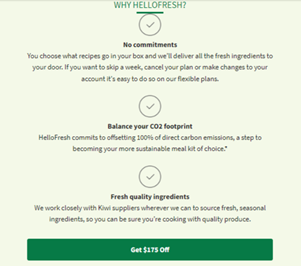
HelloFresh: Get $175 Off
Hello Fresh’s’ CTA lets customers know what benefits they will receive by taking the desired action. This call-to-action highlights the offer, bringing the discount to the forefront of the customer’s mind.
Adobe: Start Free Trial/See What’s New
This CTA offers customers options in two stages of the buyer’s journey. Someone in the decision phase will be ready to start their free trial, and those still looking into a product and increasing their awareness will have the option of seeing what new features are available.
Don’t lose your sale at the final button
Creating an effective call-to-action involves understanding your audience, setting clear goals, and using persuasive language and design. Implementing these best practices and testing your CTAs can improve conversions and drive business growth. Remember, the CTA is often the last step in a customer’s journey, so make it count! With the right approach, you can turn website visitors into paying customers and achieve your marketing objectives. If you need help crafting compelling calls to action or any other aspects of conversion rate optimisation, get in touch with the team at Pure SEO today.
Ruby joined the content team in August 2021. An avid reader and writer since she was young, Ruby always knew she wanted to work with words. After leaving high school, she studied a Bachelor of Communications majoring in journalism at Massey university. She spent a few years working as a journalist for a news app in the area she grew up in, Matakana, before joining the team at PureSEO.
Ruby also worked part time as a preschool teacher to save money for travelling. So far she has ticked Vietnam, Cambodia, and Bali off her list, and she hopes to be able to travel again soon.
GET ACTIONABLE ADVICE, WEEKLY
Subscribe to our blog and get awesome digital marketing content sent straight to your inbox.
Follow Us
FREE SEO REPORT - INSTANT
Your report will display in a new tab once you submit this form.