Conversion Rate Optimisation Guide – An Introduction
Ruby Garner
If you’re running a business, whether online or brick & mortar, you probably know how crucial it is to convert visitors into customers. Conversion refers to turning a potential customer into a paying customer or a lead into a sale. It can include a range of actions, such as filling out a form, purchasing, signing up for a subscription, or even simply clicking on a specific link or button. That’s exactly what conversion rate optimisation is all about – improving the percentage of website visitors who take the desired action on your website, such as making a purchase or filling out a form.
In this comprehensive guide, we will explore the basics of conversion rate optimisation, including what it is, why it’s important, and some simple strategies you can use to improve your website’s conversion rate. By the end of this article, you’ll better understand conversion rate optimisation and how it can help you grow your business.
A conversion is when you convert your website visitors into paying customers, leads, or other metrics by their actions on your site. A range of different actions can be considered conversions, including:
Purchase a product
Sign up for a newsletter
Subscribe to a software
Hire a service
Download a free e-book
Fill out a ‘contact us’ form
Answer a survey
Give feedback
Take any action a page encourages
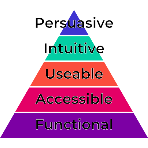
Hierarchy of conversion
The fundamental features of your website make up the foundation of what is known as the “hierarchy of conversions.” This concept is comparable to Maslow’s hierarchy of needs, which suggests that you can only accomplish specific goals after meeting basic needs. The hierarchy of conversions establishes a path from the fundamental aspects of your website to the most precise tweaks and enhancements for conversion rate optimisation (CRO).
Hierarchy of conversion
The hierarchy of conversions is as follows:
Functionality — Is your site functioning correctly, with no technical errors or security issues?
Accessibility — Can users find and access your site easily on all devices and browsers, regardless of their skill level? Are there any obstacles preventing access?
Usability — Is your site user-friendly, with fast loading times and easy navigation, allowing users to reach the final conversion pages easily?
Intuitiveness — Does the conversion process on your site proceed in a way that users would expect, anticipating their struggles and providing answers to their most likely questions?
Persuasiveness — Does your site present a compelling argument for conversion, generating interest, providing social proof, and addressing potential customers’ doubts?
When optimising your website for conversions, start at the base of this pyramid and ensure you’ve met all fundamental requirements before moving forward. This approach will ensure that you achieve the best possible outcomes from your efforts.
What is Conversion Rate Optimisation?
CRO, short for Conversion Rate Optimisation, refers to enhancing the percentage of website visitors who fulfil the website’s objective. This practice entails several stages, including user research, digital data analysis, competitive analysis, heuristic evaluation, usability testing, and A/B testing, making it continuous.
The primary aim of CRO is to influence more website visitors to take the intended action on a webpage or website. By adopting CRO, businesses can increase their conversion rates, improve online performance, and ultimately boost their bottom line.
How can you calculate the conversion rate?
To determine a website’s conversion rate, divide the number of desired actions or conversions by the total number of visitors. The outcome is multiplied by 100, providing the result as a percentage. This formula enables businesses to track their website’s performance and assess the effectiveness of their conversion rate optimisation strategies.
CR = Conversions / Total visitors * 100%
However, calculating an average rate by dividing the total number of sales by the total traffic on your website won’t be enough information to improve your business’s digital presence. You’ll need to consider several other factors in conjunction with this formula. For instance, a website with a single visitor who converts will have a 100% conversion rate, which is unlikely to sustain a business in the long run. What’s more, conversions that require a higher investment tend to have lower conversion rates than those with lower costs, but they generate more revenue overall. Therefore, businesses must consider various factors when evaluating their website’s performance and making informed decisions to enhance their digital presence.
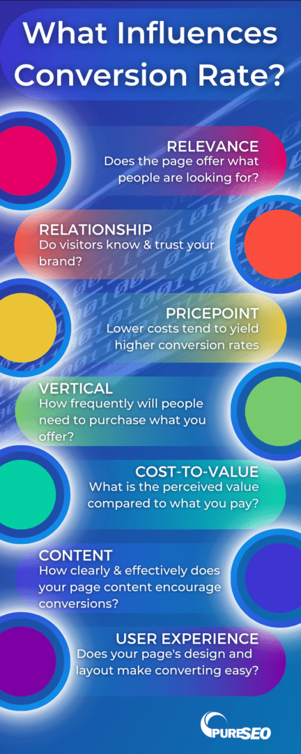
What influences your conversion rate?
Optimising your conversion rate is a vital aspect of any online business. However, achieving a high conversion rate is not always straightforward, and several factors can influence it. Understanding the elements that impact your conversion rate is essential in developing effective strategies that boost your website’s performance. Here are some of the key factors that can influence your conversion rate:
Relevancy – Is the product or service you’re offering relevant to the people who visit your site?
Relationship – Do your visitors know and trust your brand?
Business vertical – How frequently will people need to purchase what you offer?
Cost of your product – As mentioned above, lower-cost products tend to have higher conversion rates than higher-cost products.
Cost-to-value ratio – What is the perceived value of your offering compared to its cost?
Copywriting – How clear and effective is the language on your site in encouraging conversions?
User experience – Does your website’s design, usability, and user experience make converting easy?
Infographic: What Influences Conversion Rate
Conversion Rate Optimisation Process
Developing an effective Conversion Rate Optimisation (CRO) strategy requires a structured approach that accounts for several crucial steps. To maximise your website’s conversion rate, conduct thorough research, analyse data, and identify improvement areas. We delve into the CRO process and outline the critical stages involved. By following these steps, you can identify specific areas of your website that need attention and develop a strategy that optimises your conversion rate effectively.
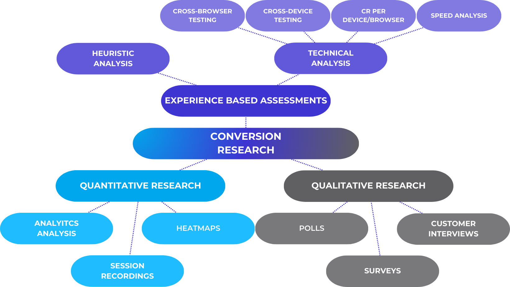
Conduct conversion research
Conversion research is a methodical investigation to gather valuable user or customer behaviour insights. This approach employs qualitative and quantitative methodologies to formulate observable hypotheses within a practical framework, such as A/B testing. By leveraging conversion research, businesses can better understand their target audience, needs, and preferences, enabling them to optimise their website and increase their conversion rates effectively.
Conversion Research Framework
Experience-based assessment
Experience-based assessments evaluate a website or online platform’s usability, user experience, and overall performance.
Through experience-based assessment, CRO specialists can identify areas where the website or platform needs improvement, such as navigation, content, and design. There are two different ways to analyse the results of an experience-based assessment, heuristic analysis and technical analysis.
Heuristic analysis — A heuristic evaluation involves using a set of research and principles that represent the best practices a website should adhere to. This method identifies potential usability issues within a website, providing valuable insights for making informed changes to improve performance. One of the significant advantages of this technique is its cost-effectiveness and ability to provide quick feedback. By leveraging heuristic evaluation, businesses can make informed decisions and improve their website’s user experience, resulting in increased conversions.
Technical analysis — Technical analysis refers to evaluating a website’s technical aspects to identify potential issues affecting its performance, user experience, and conversion rate. Technical analysis typically involves the following:
Cross-browser testing
Cross-device testing
Conversion rate per device/browser
Speed analysis
This involves testing a website on different browsers to ensure it is compatible with all major browsers, such as Chrome, Firefox, Safari, and Edge.
This involves testing a website on various devices, including desktops, laptops, tablets, and smartphones, to ensure that it is responsive and provides a seamless user experience across all devices.
This involves analysing the conversion rates of a website on different devices and browsers to identify any performance issues that may be affecting conversion rates.
This involves analysing a website’s loading speed to identify any issues that may be slowing down the website and affecting user experience.
Quantitative Research
Quantitative research is a type of research that involves the collection and analysis of numerical data. Quantitative research typically involves the following:
Analytics Analysis: Analysing website analytics involves looking at website traffic data to identify patterns, trends, and insights into user behaviour. Analytics tools like Google Analytics provide businesses with valuable data on website traffic, traffic sources, exit rate, browser, device, screen resolution, behaviour flow and more. Analytics analysis will indicate whether you require a technical analysis or not.
Heatmaps: Heatmaps are graphical representations of website user behaviour. They show how users interact with a website, including where they click, how far they scroll, and where they spend the most time. Heatmaps can identify usability issues, such as areas of a website that are not receiving enough attention from users.
Session recordings: Session recordings are videos of website user sessions. They show how users navigate a website, including where they click, how far they scroll, and where they get stuck. Session recordings can identify usability issues and areas of a website that are causing frustration for users.
Qualitative Research
Qualitative research is a type of research that involves collecting non-numerical data to gain insights into user behaviour and preferences. Qualitative research typically involves the following:
Polls: Polls are short surveys used to gather feedback from website visitors. They are typically used to gauge user opinions on specific aspects of a website, such as identifying areas of a website that users find confusing or difficult to use.
Surveys: Surveys are more in-depth than polls and are typically used to gather feedback on various topics. Surveys can identify user preferences, pain points, and areas for improvement. They can also gather demographic information about website visitors.
Customer interviews: Customer interviews involve speaking directly with website users to gain insights into their behaviour and preferences. Interviews can be conducted in person, over the phone, or online. They can gather in-depth feedback on specific aspects of a website and identify user pain points and areas for improvement.
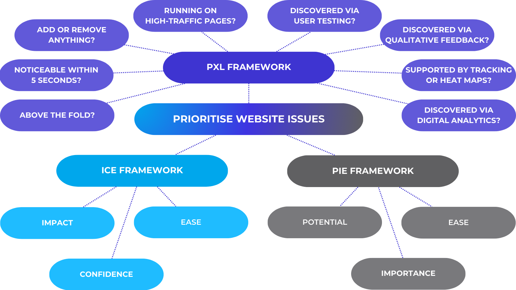
Prioritise website issues
Prioritise the pages on your website that are performing badly in conversions and have user issues. Narrow it down to pages likely to have the most valuable traffic, which can be paid traffic or traffic relevant to your product offering. From there, begin optimising pages, starting with those with the highest impact and moving down the list. Focusing your time and energy on the pages that hold greater significance for your business will yield higher returns. Several frameworks are available to help you identify the areas that require priority attention in your CRO strategy.
Website Issues Prioritisation Frameworks
PIE Framework
Potential — To determine which pages require priority attention, assess the possible improvements and prioritise the worst performers. Consider web analytics data, customer data, and expert heuristic analysis of user scenarios.
Importance — Identify your most important pages by evaluating the value of their traffic. Pages with high volume and costly traffic are the highest priority. Pages that perform poorly but lack a significant volume of costly traffic are not necessarily testing priorities.
Ease — Consider the difficulty of implementing a test on a particular page or template, including technical implementation and organisational or political barriers. The goal is to achieve the same return with minimum time and resources. A technically easy page to test may face political barriers due to multiple stakeholders or vested interests, such as the homepage.
ICE Framework
Impact — Estimate the expected impact of the test by analysing relevant metrics and past data and predicting the impact on the baseline metric.
Confidence —Assess the confidence level in the test hypothesis by utilising data and experience to assign a score.
Ease — Determine how easily you could launch the test, considering whether the idea requires development work and can be completed independently as a marketer. Assign a higher score to ideas that require minimal effort to launch.
PXL Framework
The PXL framework for conversion rate optimisation is a process that helps to identify and prioritise website optimisation opportunities based on their potential impact. This framework does not rely on guesswork to evaluate the potential impact of a change. Instead, it asks a set of questions to determine the potential impact:
Is the change placed above the fold? Changes above the fold are more visible and have a greater chance of impacting users.
Is the change noticeable within 5 seconds? By showing control and variation(s) to a group of people, the framework assesses whether users can differentiate between the two after seeing it for 5 seconds. If not, the change is likely to have less impact.
Does the change add or remove anything? Larger changes—like removing distractions or adding key information—tend to have a greater impact.
Does the test run on high-traffic pages? Changes that result in a relative improvement on high-traffic pages translate to a greater absolute impact in terms of revenue.
Does it resolve a problem identified through user testing?
Does it resolve a problem identified through qualitative feedback such as surveys, polls, or interviews?
Is the hypothesis supported by mouse-tracking, heat maps, or eye-tracking?
Does it address insights obtained from digital analytics?
Formulate testing hypotheses
Formulating a testing hypothesis is an important step in the CRO process as it helps to define what you’ll test and what success will look like. Here are the general steps to follow in formulating a testing hypothesis:
Justify the change — Develop a hypothesis that explains why you think making a specific change to your website will achieve the desired result. For example, if you want to increase conversions on a specific page, you may hypothesise that adding a call-to-action button above the fold on the page will make it more noticeable and increase the click-through rate.
Determine the variables — To test your hypothesis, determine the variables that will be changed and measured. For example, in the above hypothesis, the variable would be the location of the call-to-action button on the page, and the measurement would be the click-through rate.
Plan the test — Finally, plan the test by outlining the steps you will take to implement the change, measure the results, and analyse the data. Test planning should include the test’s sample size, duration, and statistical significance level.
Conduct testing
After pinpointing the problems with your website and determining your objectives for progress, the next step is to verify and gain knowledge by testing those issues. Select a testing tool and generate alternative versions or treatments against the existing page (control).
A/B testing is common for determining the effectiveness of CRO strategies. The original version of a webpage is referred to as the control, while the new versions are variations, challengers, or recipes. The testing process aims to identify the page design that generates more conversions.
For example, A/B testing software may randomly divide a website’s homepage visitors evenly between the control and the new challenger. The test aims to determine which design generates more orders or conversions. Therefore, the A/B testing software can monitor the conversions generated by each design. Upon completion of the test, the A/B testing software determines the winning design based on the number of conversions. However, not all software will provide accurate results. So, we must do an independent calculation to verify. A calculator like CXL’s AB+ Test Calculator can ensure accuracy.
Let’s say you have an e-commerce website and want to improve the conversion rate on your product page. You hypothesise that changing the placement of the “Add to Cart” button will increase the number of users who add products to their cart.
To conduct an A/B test, divide your website’s traffic into Group A and Group B. For Group A, you keep the original design of the product page with the existing placement of the “Add to Cart” button. For Group B, you make a variation of the product page where you change the placement of the “Add to Cart” button to a different location on the web page.
Both versions of the product page are shown randomly to the users visiting your website. You track the number of users who view the product page and the number of users who click the “Add to Cart” button in each group.
After running the A/B test for a sufficient duration to gather a statistically significant amount of data, you analyse the results. Let’s say the conversion rate is significantly higher in Group B—the variation with the changed button placement—compared to Group A—the control group. This means the hypothesis is supported, and the changed button placement positively impacts the conversion rate.
Based on this result, you can confidently implement the variation with the new button placement on your product page, as it has shown to be more effective in encouraging users to add products to their cart. This A/B test has helped you optimise the conversion rate on your website by providing data-driven insights for decision-making. Conducting A/B tests eliminates considerable speculation from your marketing procedures and enables you to discover which materials substantially influence your audience.
Conduct post-test analysis
After completing the experiment, it is essential to evaluate the results to determine how the control and variation fared. This phase is critical as it provides valuable insights from winning and losing tests. The A/B testing tool used will display the performance of each version and indicate if there is a statistically significant difference between them.
If the variation wins, your hard work has paid off. However, it is important to address the following questions:
What are the associated costs of implementing the engineering and design hours changes?
Does the projected increase in revenue justify the actual cost incurred?
If your control page has the most conversions, it is important to take the following steps:
Analyse your research, review your hypothesis, and identify any shortcomings.
Thoroughly examine the test data and extract meaningful insights.
Verify your research data using all the data-gathering tools employed.
Review relevant case studies to gain new perspectives and insights that may have been overlooked previously.
Revise your hypothesis to incorporate new insights and observations from the initial research.
Conduct another round of testing to refine your approach.
Start your optimisation with these pages:
Homepage
The homepage represents an ideal target for implementing a CRO strategy, as it often serves as the initial contact point for new site visitors. By carefully crafting and optimising the homepage, you can leverage it to direct visitors to other essential pages. You can accomplish this by highlighting links to popular product pages, category pages, FAQs, testimonials, and other relevant sections.
By arranging your homepage this way, visitors are encouraged to engage with your site further, progressing deeper into the purchase funnel and ultimately increasing the chances of successful conversion.
How to improve CRO for your homepage?
As the entryway to your company, your homepage wears many hats. From welcoming visitors to demonstrating your brand, homepages are busy multi-taskers dedicated to leading visitors to desired pages, displaying products or services, and establishing authority within your field. And now you have to worry about conversion too!
Lead generation pages can capture information from potential customers and convert them into leads for a business. If a lead generation page is not optimised, it may not effectively capture the attention of potential customers or convince them to provide their information.
CRO can help improve the performance of lead generation pages by identifying and addressing issues that may be preventing visitors from converting into leads. CRO techniques can help improve the clarity of the messaging, increase the call-to-action (CTA) prominence, and reduce distractions that may be drawing visitors away from the conversion process.
By tracking and analysing user data, businesses can better understand what page elements are working well and which ones need improvement. This information can refine the design and content of the page to better meet the target audience’s needs.
Form Optimisation Insights to Achieve Better Conversions
Form optimisation is improving the design and functionality of web forms to increase user engagement and conversion rates.
Service pages are important as they provide potential customers with information about the services offered by a business.
CRO can help highlight the unique selling point by making it more prominent on the service page, helping potential customers understand the service’s value proposition and increasing the likelihood of conversion.
It can also make it easier for potential customers to find the necessary information, reducing exit rates and increasing the chances of conversion.
Category pages
The category page acts as a connector between the homepage and the product page, grouping similar products.
Optimising category pages is crucial for conversion rate optimisation since users can easily become frustrated and leave the site if they can’t find what they are looking for.
CRO research can identify how users categorise the items sold on the website. It’s easy to assume that categorising items as male, female, or child products is the best approach, although better categories could help users locate the items they need more efficiently.
Product pages
The product page represents a critical juncture for any eCommerce website, as it frequently represents the primary source of revenue for many businesses. An unoptimised product page can have a severe negative impact on a company’s bottom line.
Fortunately, CRO offers a range of techniques that can help enhance the performance of a product page, ultimately leading to increased revenue. Some of these methods include testing different messaging approaches, experimenting with various page layouts, trying out different types of offers, and comparing different images for product presentation, among other tactics.
Cart page
The eCommerce cart page allows potential buyers to view all the items they want, like a physical shopping basket. However, the experience many shoppers have with cart pages is often negative.
Common complaints include difficulty finding items in the cart, inability to see and calculate the total order upfront, requiring users to create an account, and unsatisfactory return policies. To improve the conversion rate and prevent these issues, CRO is essential.
Customer research is a crucial first step, and surveys can trigger when users want to exit the cart page without proceeding to checkout. Once you’ve identified the issues, prioritise and create hypotheses for the biggest ones, test them against the control cart page, and implement the winner.
High-performing cart pages often include editable options, upselling and cross-selling features, clear pricing and shipping information, and high-quality product images.
Checkout page
The checkout page is a crucial part of any eCommerce site as it’s the virtual equivalent of a physical checkout counter. If the checkout page is poorly optimised, customers may abandon their carts. Even if the product page is well-designed, a poorly designed checkout page can create friction for customers during checkout.
Some common issues customers face when using checkout pages include a confusing layout, multi-step checkouts that require account creation, links used as calls-to-action instead of buttons, lack of popular payment options, and inability to save payment information for future use.
Conversion Rate Optimisation (CRO) can address these issues. For instance, setting up exit-intent surveys that prompt customers to provide feedback before they abandon their carts can help identify the specific problems they encounter. Conducting Jobs-To-Be-Done (JTBD) interviews with successful customers can also provide insights into what motivated them to complete their orders, what challenges they faced, and how to improve the checkout page for better conversions.
Nine useful tools for conversion rate optimisation
With the right tools, you can gain valuable insights into user behaviour, identify areas for improvement, and ultimately increase your website’s conversion rate. We’ve compiled a list of nine useful tools for CRO that can help you take your website to the next level. Whether you’re looking to conduct A/B tests, track user behaviour, or improve your website’s load times, these tools will provide valuable insights and help you optimise your website for maximum conversions.
Google Analytics 4 (GA4)
GA4 offers features and tools to help businesses better understand their website users and optimise their conversion funnel.
GA4 has a user-centric approach, allowing businesses to track individual users’ behaviour across multiple devices and sessions and providing a more comprehensive view of the customer journey. This visibility can help businesses identify pain points and areas of improvement in the conversion funnel, leading to better optimisation and higher conversion rates. Additionally, GA4 offers a more flexible tracking setup, allowing businesses to track custom events and actions and providing more accurate data for analysis. With these capabilities, businesses can identify and optimise actions that lead to conversions, such as form submissions or button clicks.
Hotjar
Hotjar is a powerful behaviour analytics tool that offers valuable insights into how users interact with your website. With Hotjar, you can identify any obstacles or issues visitors may face during their browsing journey and collect feedback directly from customers about their website experience.
Hotjar provides valuable context to the data collected by Google Analytics and helps answer important questions related to the behaviour of your visitors and customers. Unlike GA, Hotjar offers insights into specific areas with products such as:
Heatmaps — Heatmaps allow you to see where users click, tap, and scroll on your website. Identify the most popular areas with your users and areas needing improvement.
Session Recordings — Session recordings allow you to watch recordings of users interacting with your website. Understand how users navigate your site and identify usability issues.
Feedback Polls — Feedback polls allow you to ask your users questions about their experience on your website. Gather feedback and insights to improve your site.
Surveys — Surveys allow you to collect more detailed feedback about your users’ experience on your website. Collect insights about user needs, preferences, and pain points.
Incoming Feedback — Incoming feedback allows you to collect feedback from your users in real-time as they interact with your website. Quickly address any issues or concerns that users may have.
Crazy Egg
Crazy Egg offers various features to help you optimise your website for higher conversions. Some of its features include:
Heatmaps — This feature lets you see where users click, scroll, and interact with your website. This information can help you identify areas where users are losing interest or experiencing difficulties.
Scrollmaps — This feature shows how far users scroll down on your web pages. You can identify which parts of your page are most engaging to users and which are causing them to lose interest.
A/B testing — Crazy Egg allows you to conduct A/B testing to compare the performance of different versions of your web pages. Identify the changes that lead to higher conversions.
User recordings — This feature records user sessions, allowing you to see how users interact with your website in real-time and helping you identify usability issues and areas for improvement.
Surveys — Surveys help you gather feedback, measure success, and boost engagement with your website visitors.
Traffic Analysis — This feature allows you to analyse website traffic based on where your visitors come from and compare the performance of referring traffic, campaigns, and landing pages against each other.
PageSense
PageSense is a conversion rate optimisation tool that allows you to create and run experiments to improve your website’s conversion rates. Additionally, PageSense provides insights into how users interact with your websites, such as heatmaps and click maps, which can help you identify areas of your website that need improvement. They offer a range of features, including:
A/B Testing — PageSense allows you to create and run A/B tests to compare different versions of your website’s pages, helping you understand which design, copy, or layout changes are most effective in driving conversions.
Heatmaps — Heatmaps allow you to see how users interact with your website’s pages. PageSense provides a click and scrolls heatmaps to help you understand which elements of your pages are the most engaging to users.
Funnel Analysis — PageSense’s funnel analysis feature helps you visualise and analyse user behaviour as they navigate your website’s pages, allowing you to identify and optimise conversion paths to increase conversion rates.
Form Analysis — PageSense provides a form analysis feature that helps you understand user behaviour on your website’s forms. You can identify form fields users struggle with or abandon and optimise your forms to improve completion rates.
Personalisation — PageSense lets you personalise your website’s pages based on user behaviour and other variables such as location, device type, and referral source, helping you deliver a more tailored experience to users and increase engagement.
VWO
VWO is a popular and effective tool for CRO. It offers a range of features, such as A/B testing, heatmaps, user recordings, and personalisation. VWO is user-friendly and provides insights that can help optimise conversion rates. Its A/B testing functionality is particularly robust, allowing users to run tests on various aspects of their website and easily analyse the results.
Additionally, VWO integrates with various other tools such as Google Analytics, Hotjar, and Shopify, making it a versatile option for optimising website performance. They also offer VWO FullStack Mobile App, a feature that allows customers to build better mobile apps by rapidly testing new ideas, and VWO FullStack Server-side, which gives you the server-side flexibility to run omnichannel experiments with deep segmentation capabilities without any performance impact to build consistent, higher-performing experiences.
Microsoft Clarity
Microsoft Clarity is a free Heatmaps and session recordings tool that provides insights into how users interact with your website. Clarity allows you to track user behaviour, see heatmaps, and analyse session recordings to understand how users engage with your site. This information can identify areas where users may be struggling and then make data-driven decisions to optimise the user experience and improve conversions. Additionally, Clarity integrates with other Microsoft products, such as Power BI, to provide more advanced data analysis and reporting capabilities.
FullStory
FullStory is a behaviour analytics software that allows you to see how users interact with your website or app. It offers features such as session replays, heatmaps, and funnel analysis that can help you understand user behaviour and identify areas for improvement. With FullStory, you can see what users are doing on your site, where they are encountering issues, and how you can optimise their experience to increase conversions.
UsabilityHub
UsabilityHub is a user-testing platform that provides a range of features to help businesses test and improve their website’s user experience. Some of the key features of Usability Hub include:
Five-Second Tests — This feature allows you to test how users perceive your website’s landing pages within five seconds, helping you identify your page’s messaging, branding, or layout issues.
Click Tests — Click tests allow you to test the usability and navigability of your website’s pages. You can identify which areas of the page users click on the most and which areas they tend to ignore.
Navigation Tests — Navigation tests allow you to test the effectiveness of your website’s navigation menu. You can test different menu structures and labels to identify the most intuitive and user-friendly option.
Preference Tests — Preference tests allow you to compare design options for your website’s pages. You can test different layouts, colour schemes, and other design elements to identify users’ preferred options.
Surveys — Usability Hub also provides a survey feature that allows you to collect user feedback about their experience on your website, helping you identify areas for improvement and gather insights about user needs and preferences.
AB Test Calculator
AB test calculators can be useful tools for CRO, as they help you determine the statistically significant winner of your A/B test results.
It’s important to use a reliable and accurate AB test calculator and to interpret the results in the context of your specific testing situation. We recommend the AB Test calculatorby CXL.
Before conducting an A/B test, it is important to perform a pre-test analysis to ensure that you’ve set up the test correctly and that the test results will be reliable. Pre-test analysis involves:
Defining the test hypothesis.
Selecting the sample size.
Determining the test duration.
Choosing the statistical significance level.
The hypothesis should clearly state the expected outcome of the test, and the sample size should be large enough to ensure that the test results are statistically significant. The test duration should be long enough to capture seasonal variations in traffic and other factors that could affect the test results. Set the statistical significance level at a threshold appropriate for the desired confidence level in the test results.
After conducting an A/B test, a post-test analysis will determine whether the test results are statistically significant and whether the changes made to the website had a positive impact on the desired metric. The post-test analysis involves calculating the test statistics and interpreting the results. Based on the post-test analysis, you may implement the winning variation or conduct further tests to optimise the website.
CRO is a journey, not a destination
Conversion rate optimisation is critical to any online business and can significantly impact your bottom line. By implementing the tips and strategies this guide outlines, you can optimise your website or landing pages to increase conversions and boost your revenue.
Remember that CRO is an ongoing process that requires continuous testing and iteration. By using data-driven insights and experimenting with different elements of your website, you can identify the most effective strategies for converting visitors into customers.
Overall, CRO is not just about making minor tweaks to your website, but it’s about understanding your audience and providing them with the best possible user experience. By focusing on the needs and preferences of your target audience, you can create a website that not only drives conversions but also builds trust and loyalty among your customers. If you need help developing an effective CRO strategy, contact the team at Pure SEO. We’ll handle the complicated bits and leave you to handle the success.
Ruby joined the content team in August 2021. An avid reader and writer since she was young, Ruby always knew she wanted to work with words. After leaving high school, she studied a Bachelor of Communications majoring in journalism at Massey university. She spent a few years working as a journalist for a news app in the area she grew up in, Matakana, before joining the team at PureSEO.
Ruby also worked part time as a preschool teacher to save money for travelling. So far she has ticked Vietnam, Cambodia, and Bali off her list, and she hopes to be able to travel again soon.
GET ACTIONABLE ADVICE, WEEKLY
Subscribe to our blog and get awesome digital marketing content sent straight to your inbox.
Follow Us
FREE SEO REPORT - INSTANT
Your report will display in a new tab once you submit this form.